Themes
1. Overview
The "Theme" feature was introduced in PML 2 26.1 to offer richer interface customisation. Through theme settings you can personalise the look of PML 2 — background images, colour schemes and more — for a better experience.
2. How to use it
To open the theme settings:
Update PML 2 to 26.1 or later.
Open PML 2 and click the " Theme" icon in the left sidebar.
You can choose either a local theme or an online theme.
1. Local themes
A local theme is a theme file stored on your computer. You can select, create/edit, package and import local themes.
Selecting a local theme
On the "Local themes" tab, select a theme and click " Apply selected" to apply it.
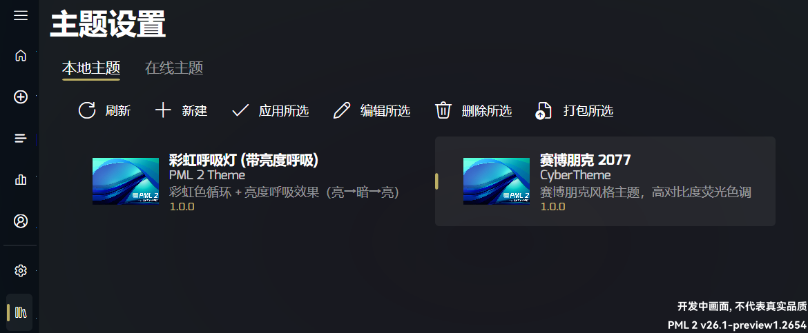
Creating a local theme
Click the " New" button in the command bar, fill in the theme details and click " Save" to create a theme.
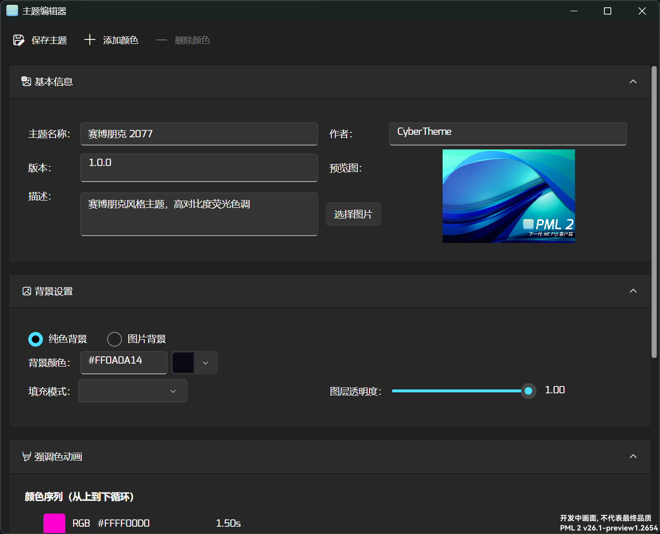
Background settings
You can choose "Solid colour" or "Image" as the background type.
Solid colour background
| Setting | Description |
|---|---|
| Colour | Set the colour with the colour picker or by entering a hexadecimal colour code directly. |
| Fill mode | Supported values are "Solid", "Radiation" and "Gradient". |
| Layer opacity | Sets the opacity of the background layer. |
Image background
| Setting | Description |
|---|---|
| Background image | Sets the background image. Both local images and image URLs are supported. |
| Fill mode | Supported values are "Fill" (stretch), "Uniform" (scale while preserving aspect ratio so the image fits the container) and "UniformToFill" (scale while preserving aspect ratio so the image completely covers the container) |
| Layer opacity | Sets the opacity of the background layer. |
BackgroundSettings section of the configuration file .Accent colour animation
Accent colour animation is a special theme effect that creates a dynamic accent colour by setting colours and their durations. You can even build a rainbow breathing light
Steps
In the "Accent colour animation" section, click the " Add colour" button. The same button is also available in the toolbar above the window.
In the editor panel on the right, pick a colour and set its duration. You can type a colour code, use the colour picker, or pick one of the presets we provide.
Click " Save theme" above to save your settings.
Font settings
PML 2 lets you choose the main font used by the application — either a system font or a custom one.
Editing a local theme
Select a theme, click " Edit selected", fill in the theme details and click " Save" to edit it.
Packaging a local theme
Select a theme, click " Package selected", fill in the theme details and click " Save" to package it.
The packaged theme file is written to <install dir>/Config/Themes Output and named <theme name>.pmla.
.pmla is a multi-type unified package format for PML 2. All PML 2 components, themes and plugins (hopefully soon) are distributed in this format. A .pmla file is essentially an archive containing all of a theme's resources and configuration files.We encrypt it to keep the file safe.
Importing a local theme
Click the " Import" button, choose one or more .pmla files and wait for the import to finish.
2. Online themes
Online themes are fetched from the official PML 2 repository. You can search, download and apply them.
Searching online themes
On the "Online themes" tab, type a keyword, wait a moment and the results appear.
Downloading / applying an online theme
In the results, select a theme and click " Download selected" to download it.
After downloading, switch to the "Local themes" tab to view and apply it.
3. Publishing a theme
Follow these steps to publish your theme to the official PML 2 repository and share it with other users:
Package your theme to produce a .pmla file.
Email the .pmla file as an attachment to our official inbox.
Click here to send the email. You need to provide:
- Author
- id
Avoid symbols, spaces and non-ASCII characters. We recommend the reverse domain name format, for example:
tech.rycb.mythical - Preview image (optional, send as an attachment)
Wait for the email to be processed.
This usually takes 3–7 business days. If you have not heard back after 7 business days, please contact the official inbox.
4. Theme configuration file
The theme configuration file is usually <install dir>/Config/Themes/<theme name>/index.json.
An example file:
{
  "Name": "赛博朋克 2077",
  "Author": "CyberTheme",
  "Description": "赛博朋克风格主题,高对比度荧光色调",
  "Version": "1.0.0",
  "AccentColor": [
    {
      "Color": "#FFFF00D0",
      "Duration": 1.5
    },
    {
      "Color": "#FF00FFAA",
      "Duration": 1.5
    },
    {
      "Color": "#FFFF4400",
      "Duration": 1.5
    },
    {
      "Color": "#FF00D0FF",
      "Duration": 1.5
    }
  ],
  "PreviewImage": null,
  "Background": {
    "Type": "SolidColor",
    "Image": null,
    "Color": "#FF0A0A14",
    "FillMode": "Radiation",
    "LayerOpacity": 1
  },
  "FontFamily": null
}
Field reference
- ColorstringA colour code. Hexadecimal formats such as
#AARRGGBBor#RRGGBBare supported. You may also use the accent keywordsaccentordefault, which the application recognises automatically. When the colour code is empty, the theme's default accent colour is used. - DurationdoubleHow long the colour is shown, in seconds.
- TypestringThe background type: "SolidColor" or "Image".
- ImagestringThe background image path; only used when the type is "Image".
- ColorstringThe background colour code. Hexadecimal formats such as
#AARRGGBBor#RRGGBBare supported. - FillModestringFill mode.
- When Type is "Image", the supported modes are "Fill" (stretch), "Uniform" (scale while preserving aspect ratio so the image fits the container) and "UniformToFill" (scale while preserving aspect ratio so the image completely covers the container).
- When Type is "SolidColor", this field describes how the background is filled. Supported values are "Solid", "Radiation" and "Gradient".
- LayerOpacitydoubleThe opacity of the background layer, from 0 to 1.
- For a custom font, put the font file in the theme directory and reference it with a relative path (without a
./prefix), for examplemyfont.ttf. - For a system font, use the font name directly, for example
Microsoft YaHei UI.